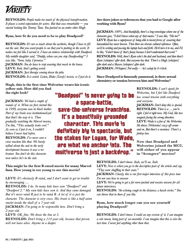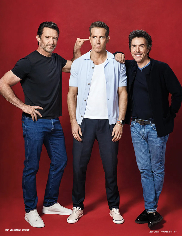
Editorial Design | Long-Form Layout System
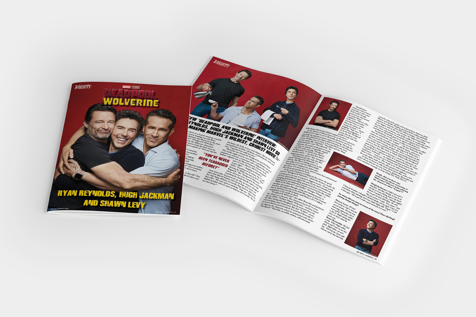
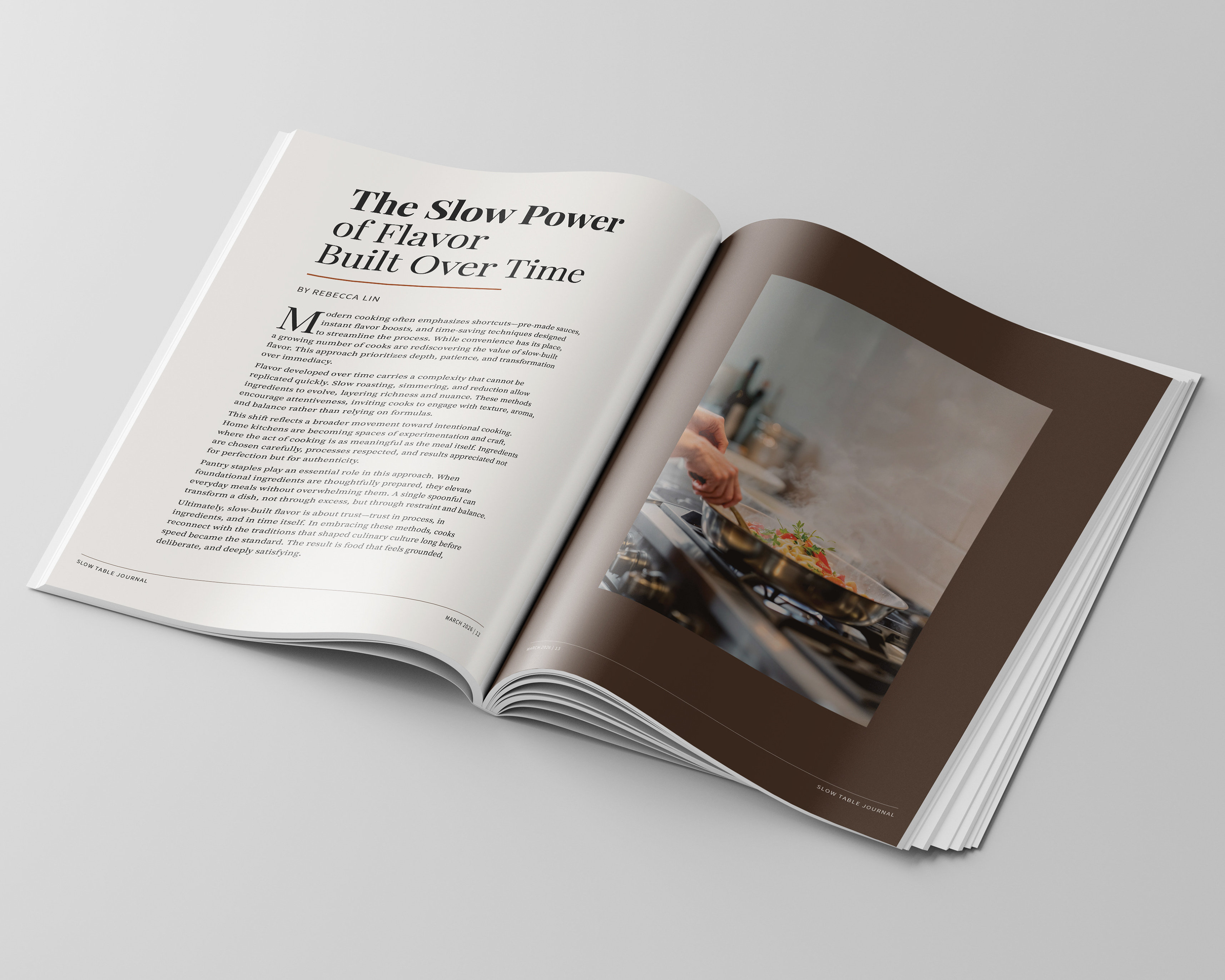
This project is a multi-page editorial feature inspired by Variety, focused on organizing long-form content with a clear, consistent layout system. The design balances bold imagery with dense interview text using a structured grid, creating rhythm and readability across multiple spreads.
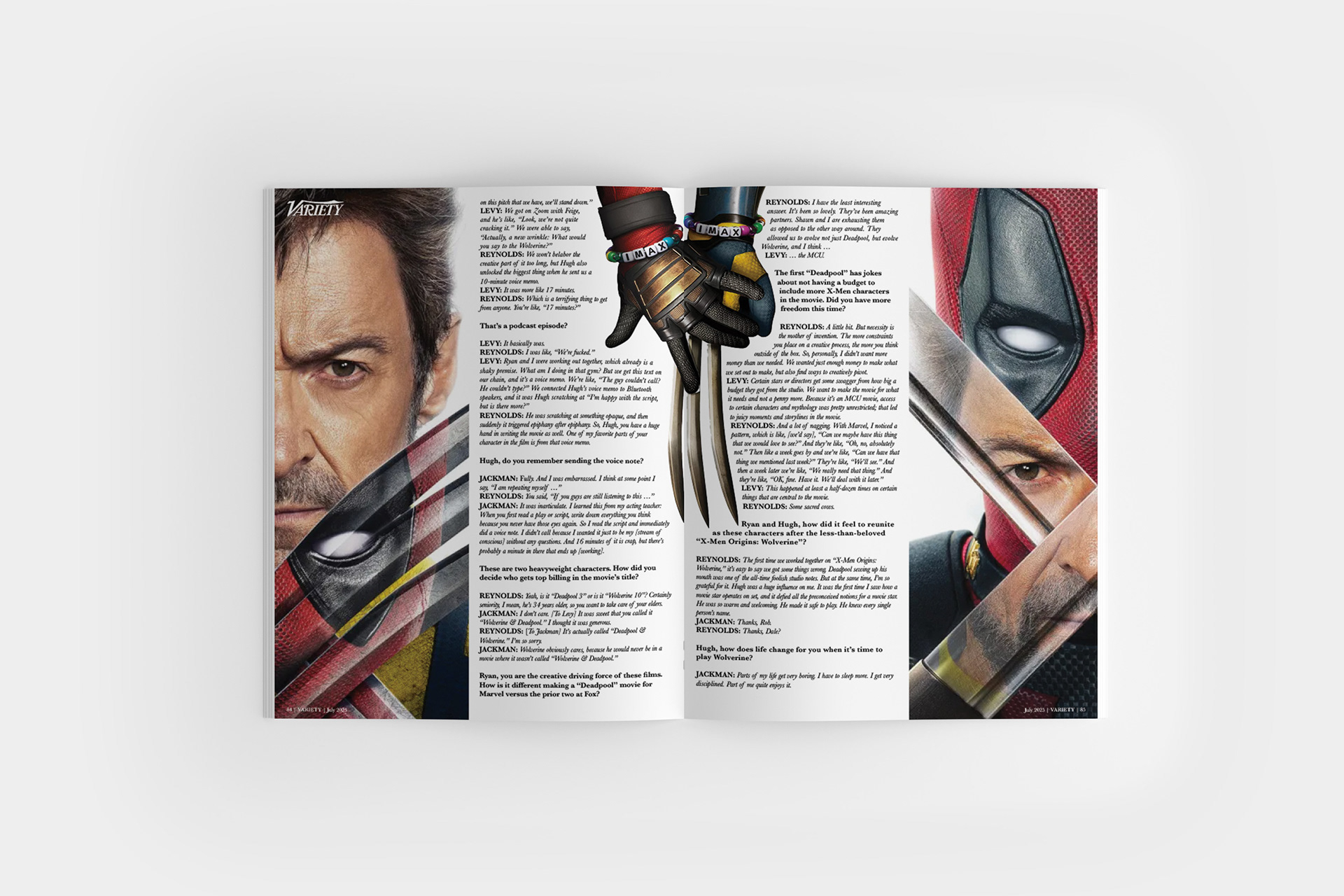
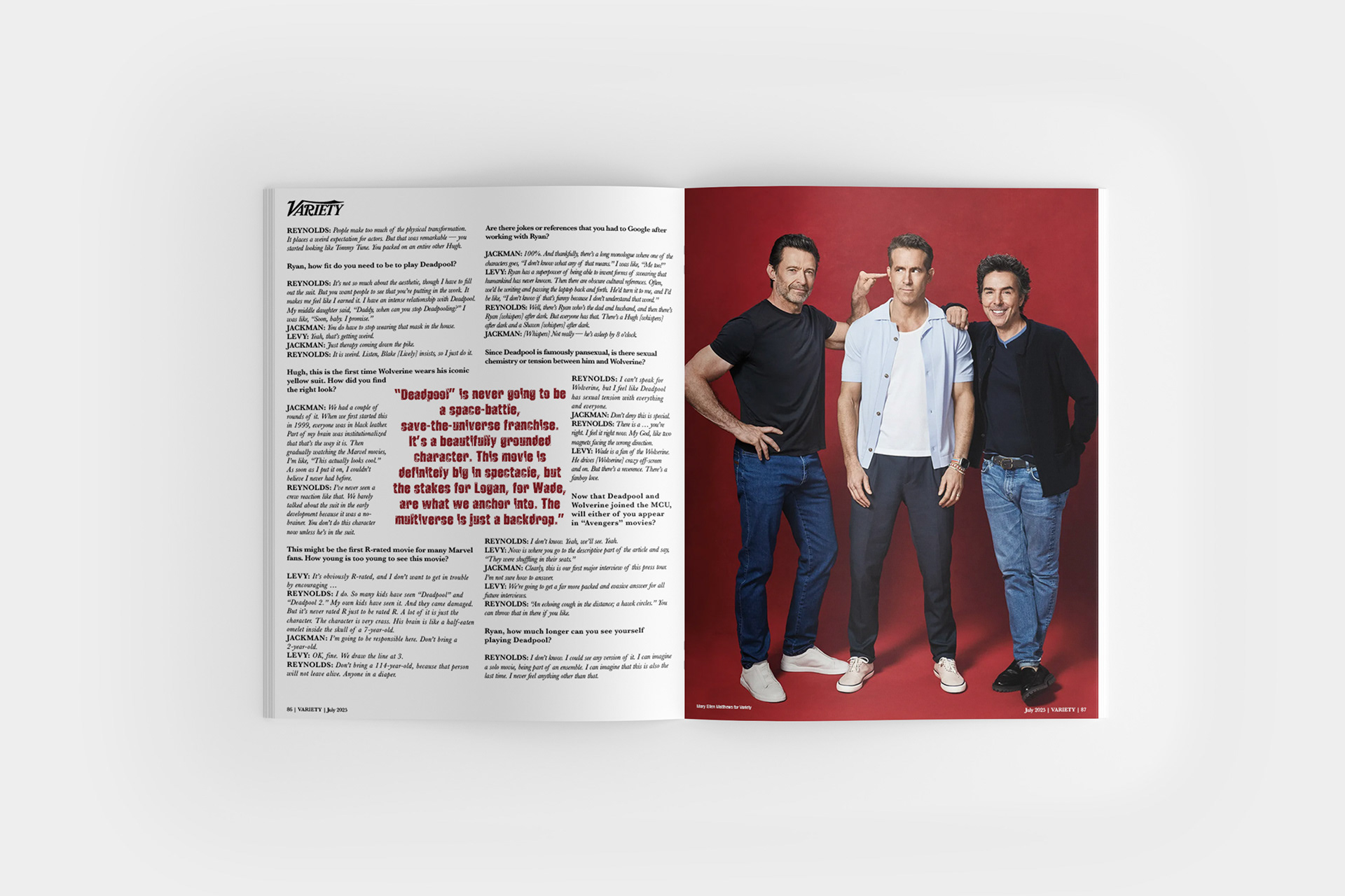
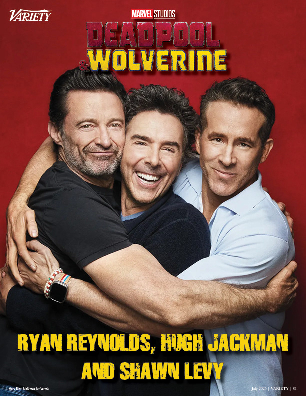
The opening spread establishes tone through strong visual impact, while subsequent pages maintain consistency through column structure, typographic hierarchy, and controlled image placement. Cropping, scale, and alignment are used to integrate imagery without disrupting the reading flow.
The result is a cohesive editorial system that supports extended content while maintaining clarity, pacing, and visual engagement throughout the publication.