Branding | Web Design | Print Collateral
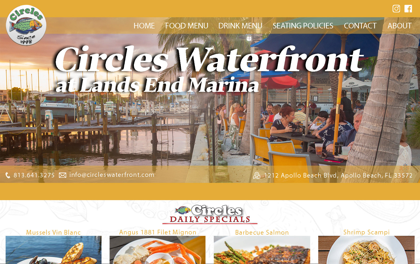
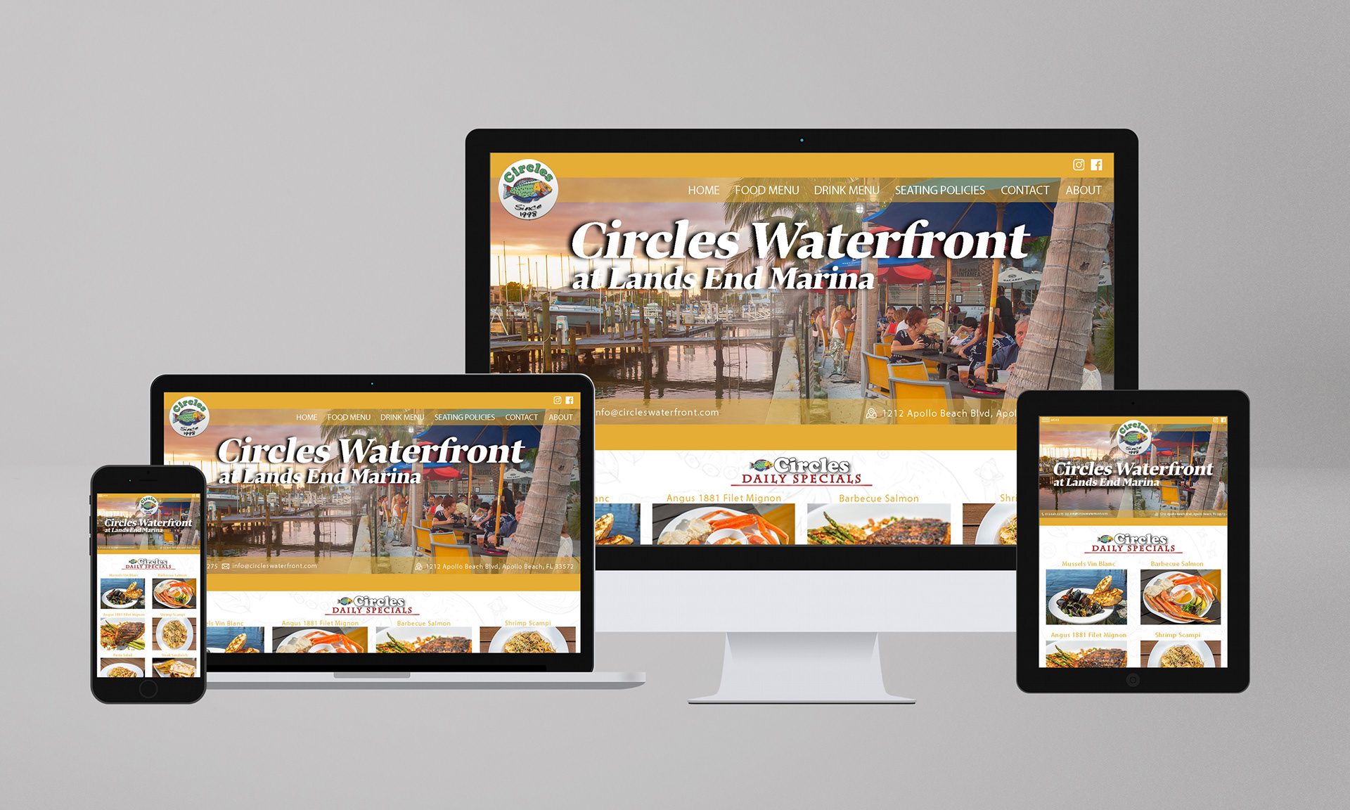
This rebranding project for Circles Waterfront at Lands End Marina focused on creating a cohesive visual identity across both digital and print platforms. The process began with a redesigned website masthead, using a warm palette of reds and oranges drawn from the existing logo to complement the natural blues of the waterfront setting. The layout emphasizes clear visual flow through anchored navigation, layered transparency, and responsive scaling across desktop, tablet, and mobile formats.
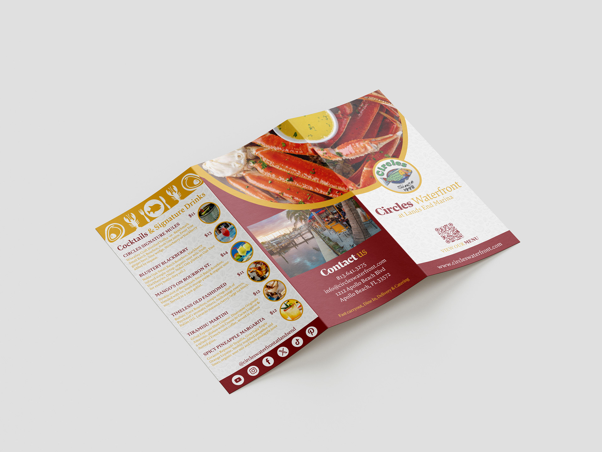
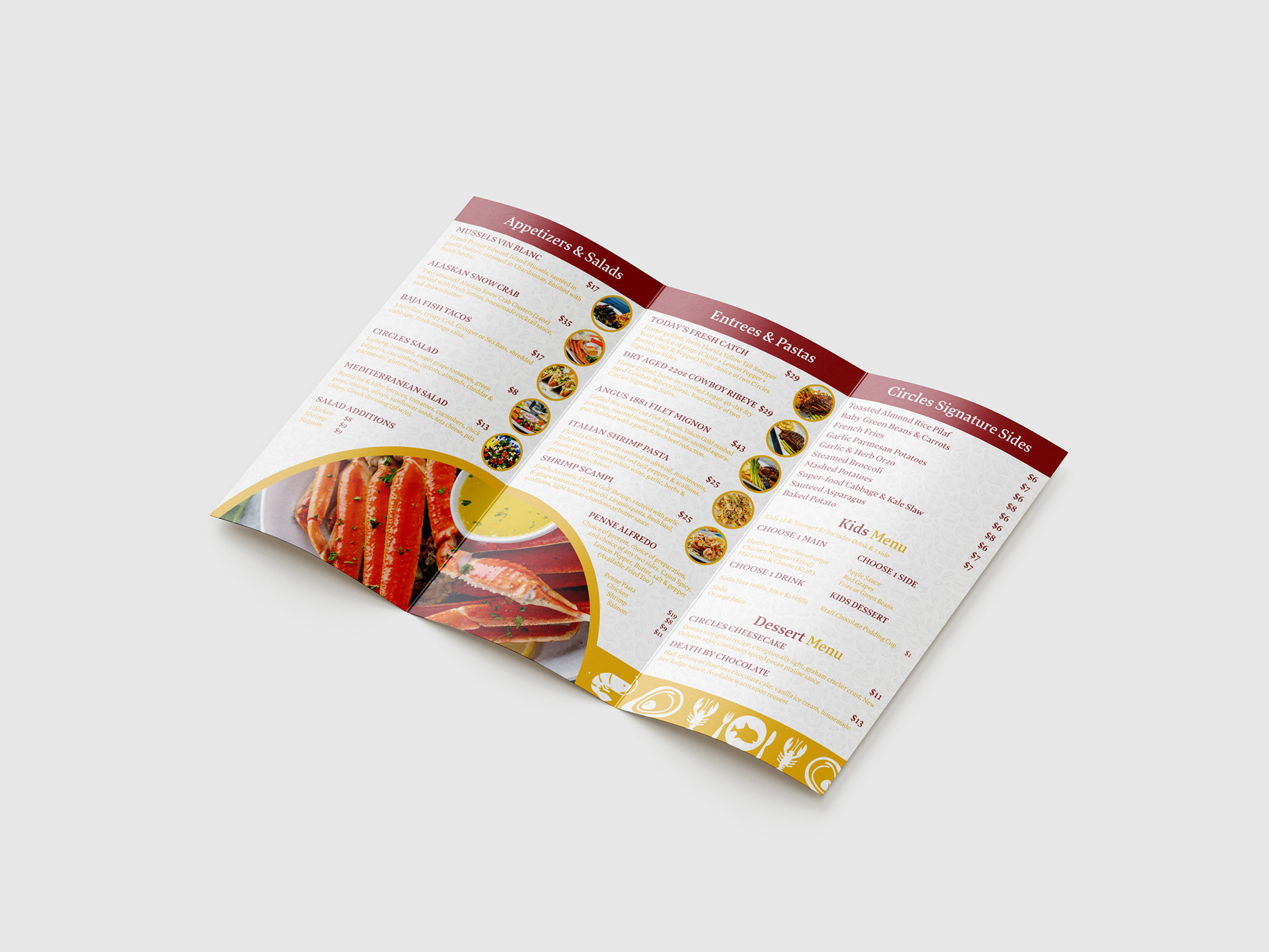
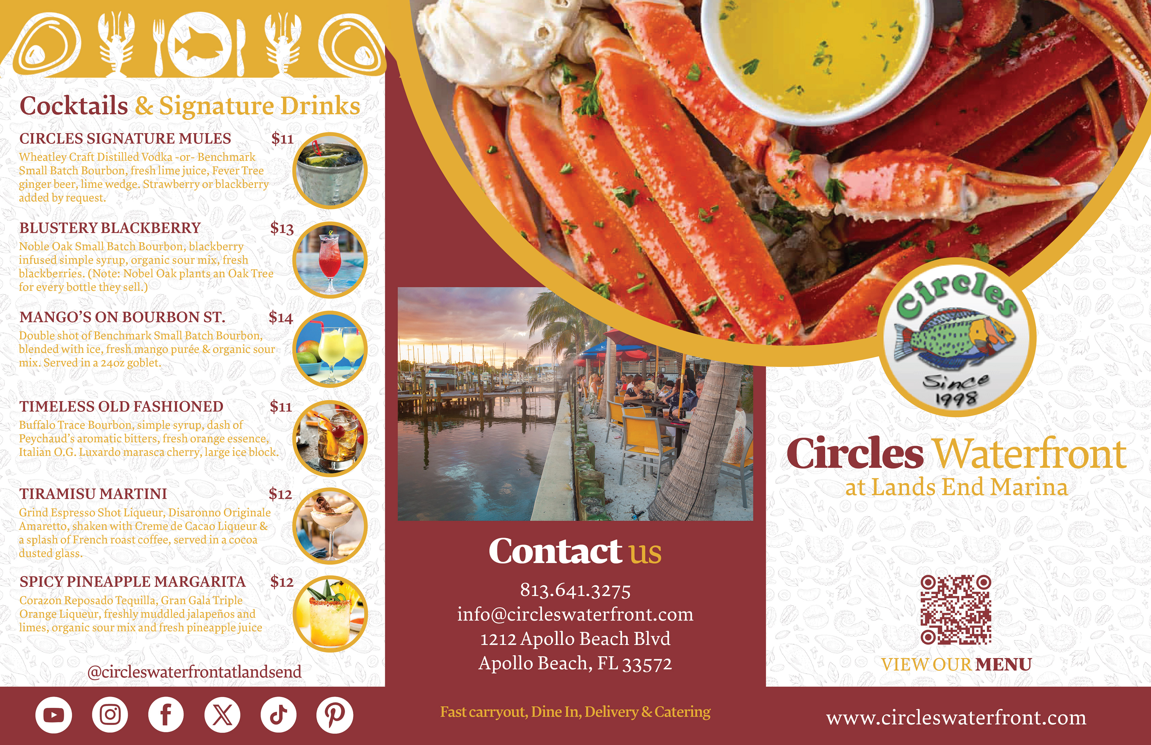
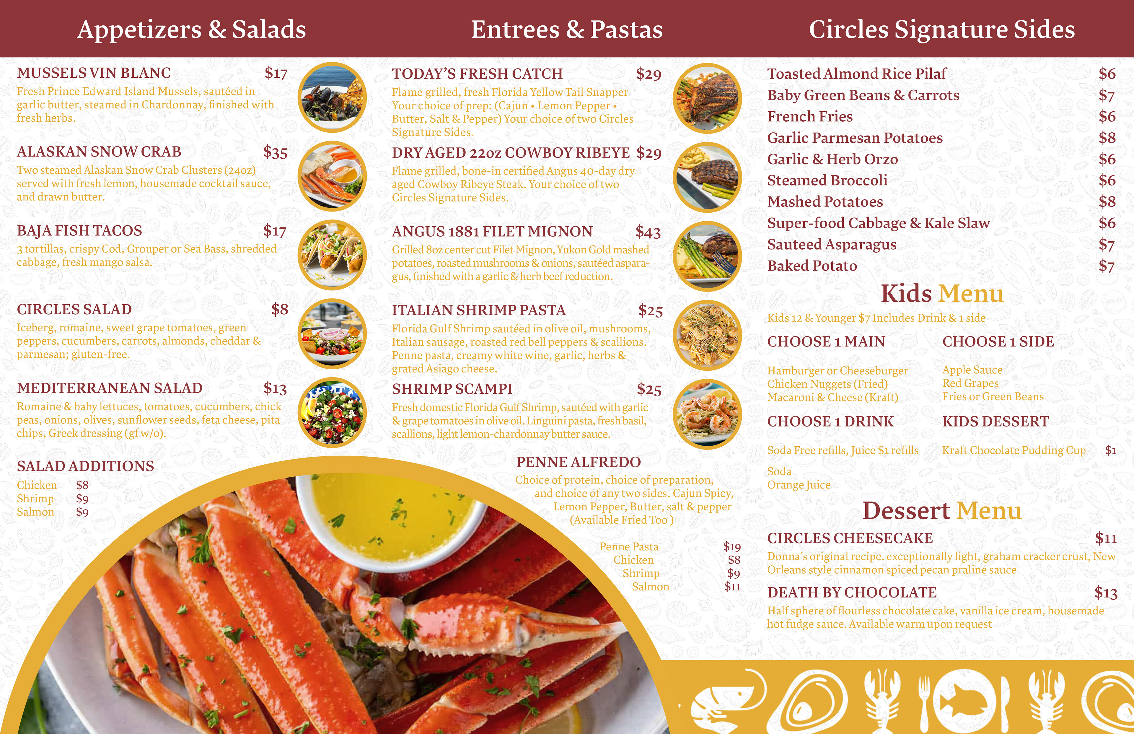
Extending this system into print, a tri-fold menu was developed to maintain consistency through color blocking, circular imagery, and subtle textured backgrounds that add depth without distracting from content. Strong typographic hierarchy ensures readability across dense menu information, while repeated circular motifs reinforce brand recognition. The result is a unified brand system that modernizes Circles Waterfront’s visual identity while preserving its approachable, coastal character across both web and print experiences.