Campaign Design | Multi-Platform Brand System
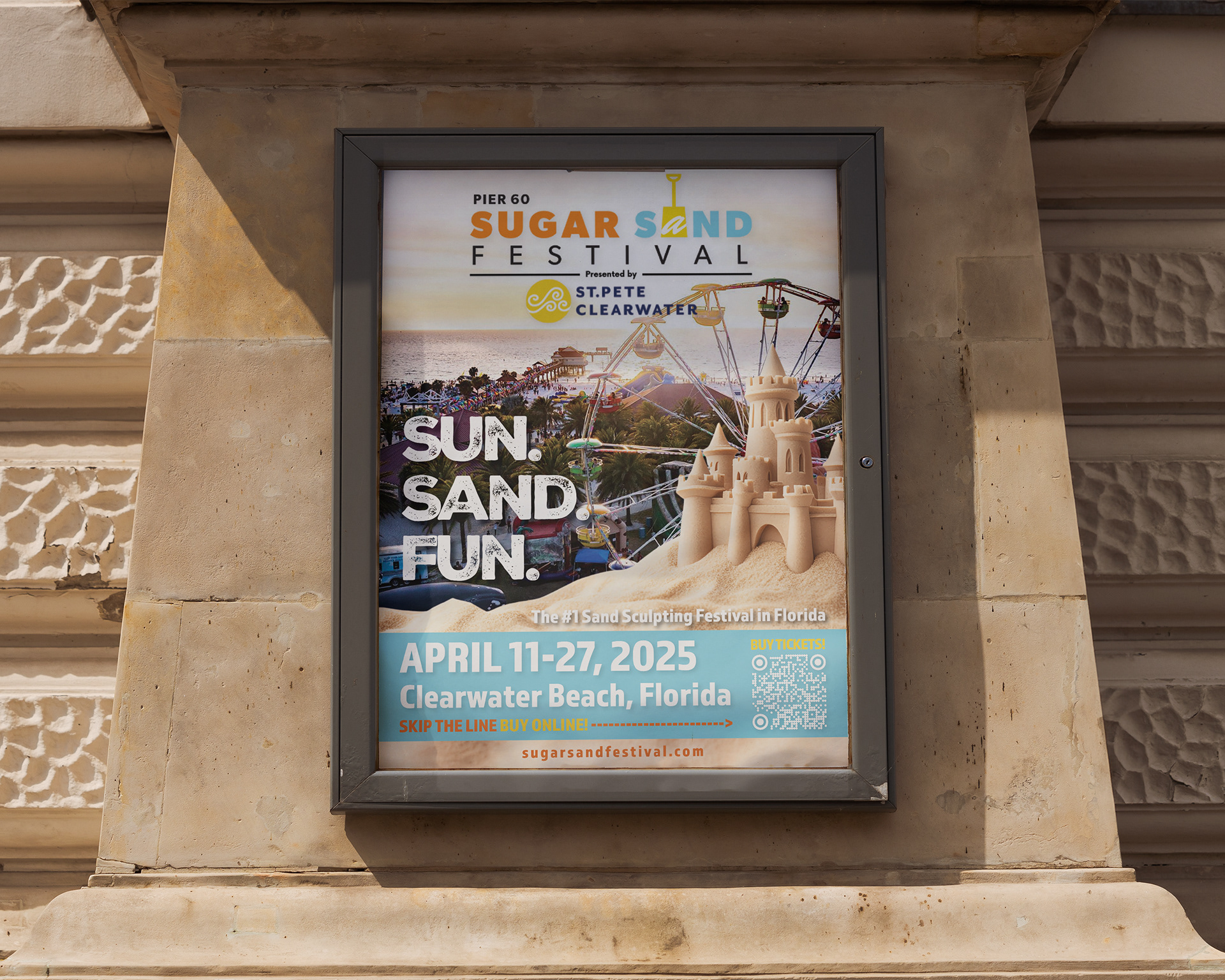
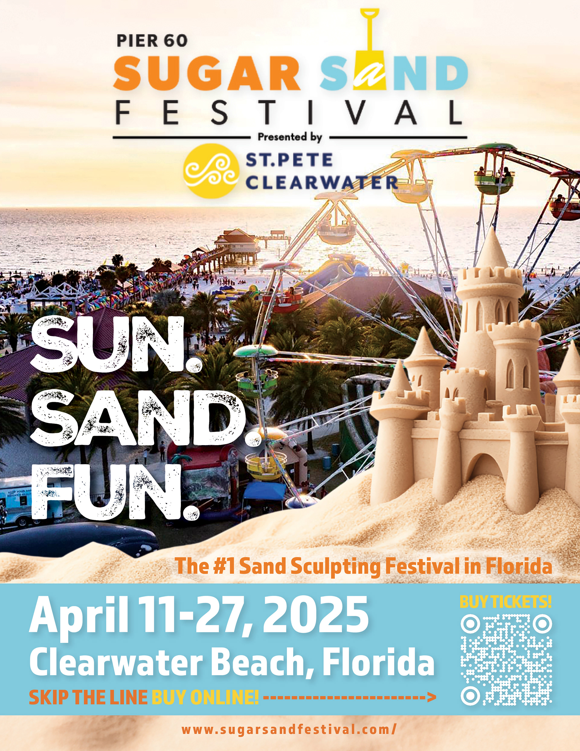
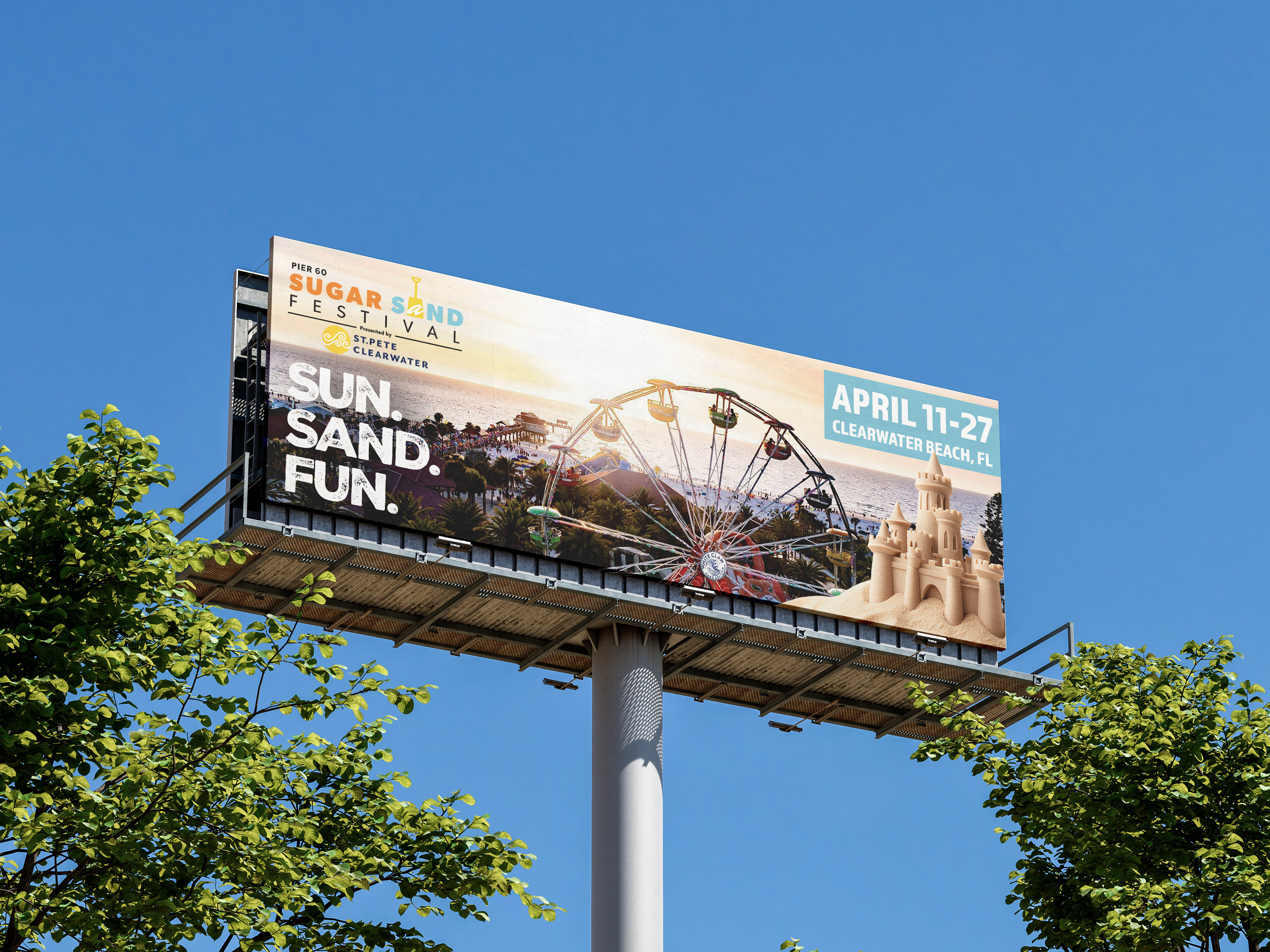
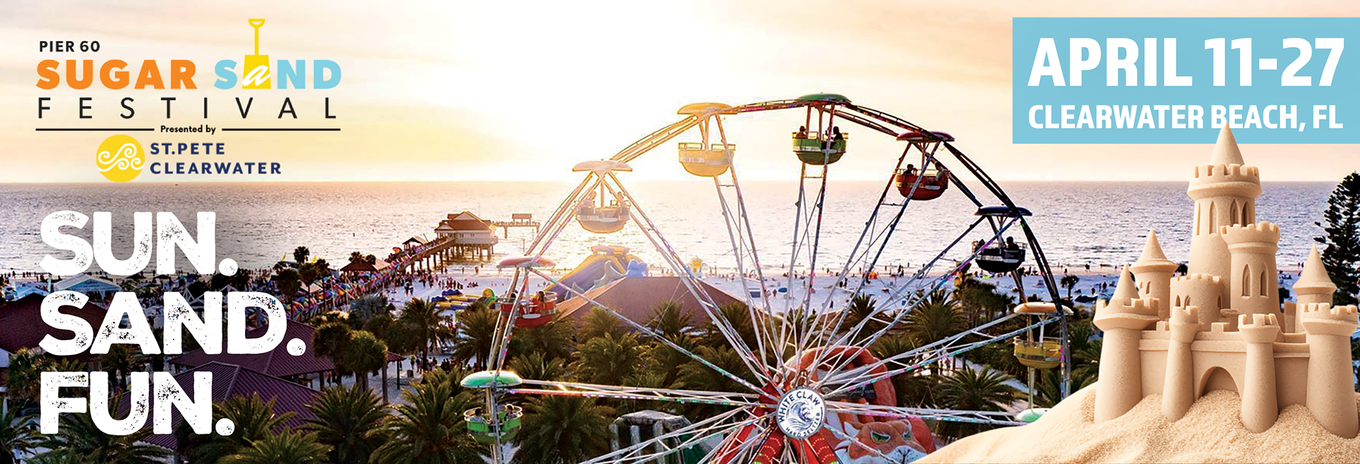
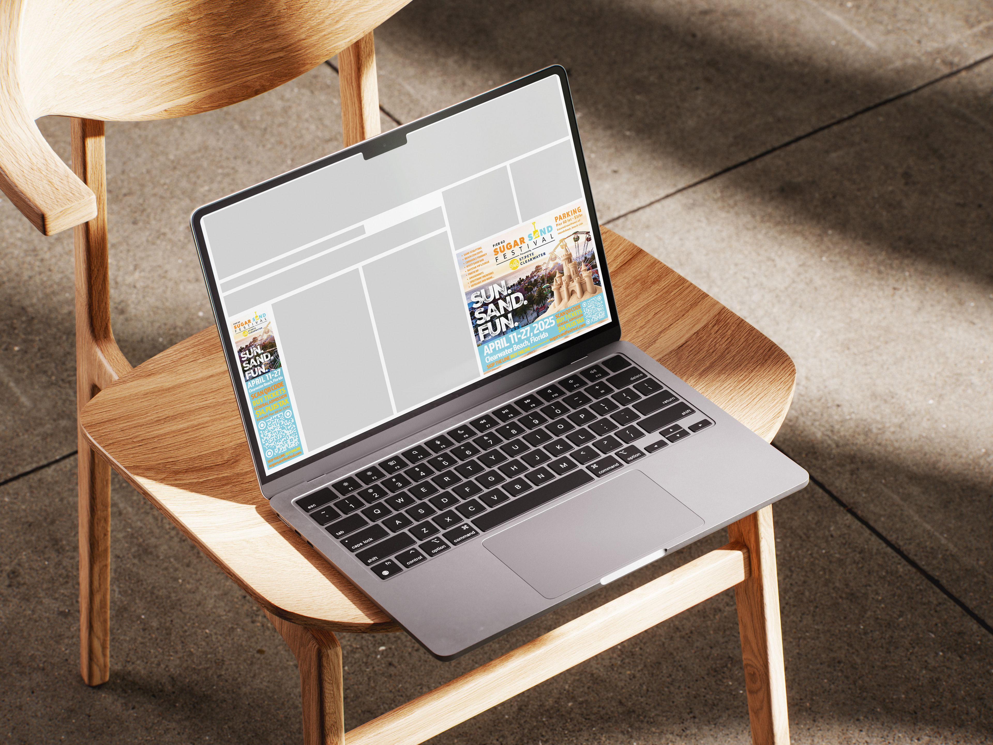
This project is a multi-platform marketing campaign for the Pier 60 Sugar Sand Festival, designed to create a cohesive visual identity across print and digital formats. The system includes a poster, web banners, and large-format billboard applications, all built around a unified hierarchy and consistent brand language.
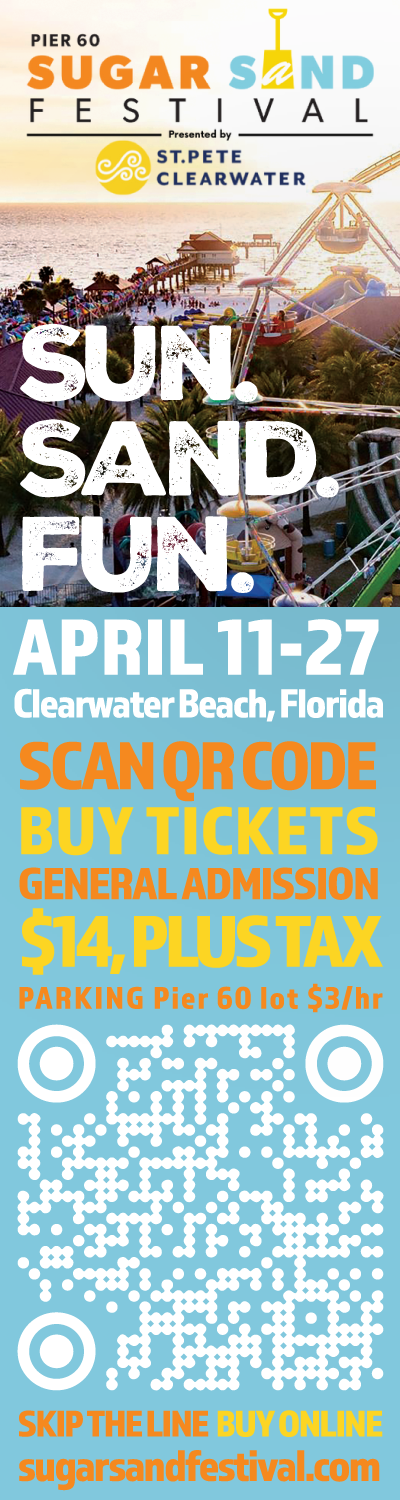
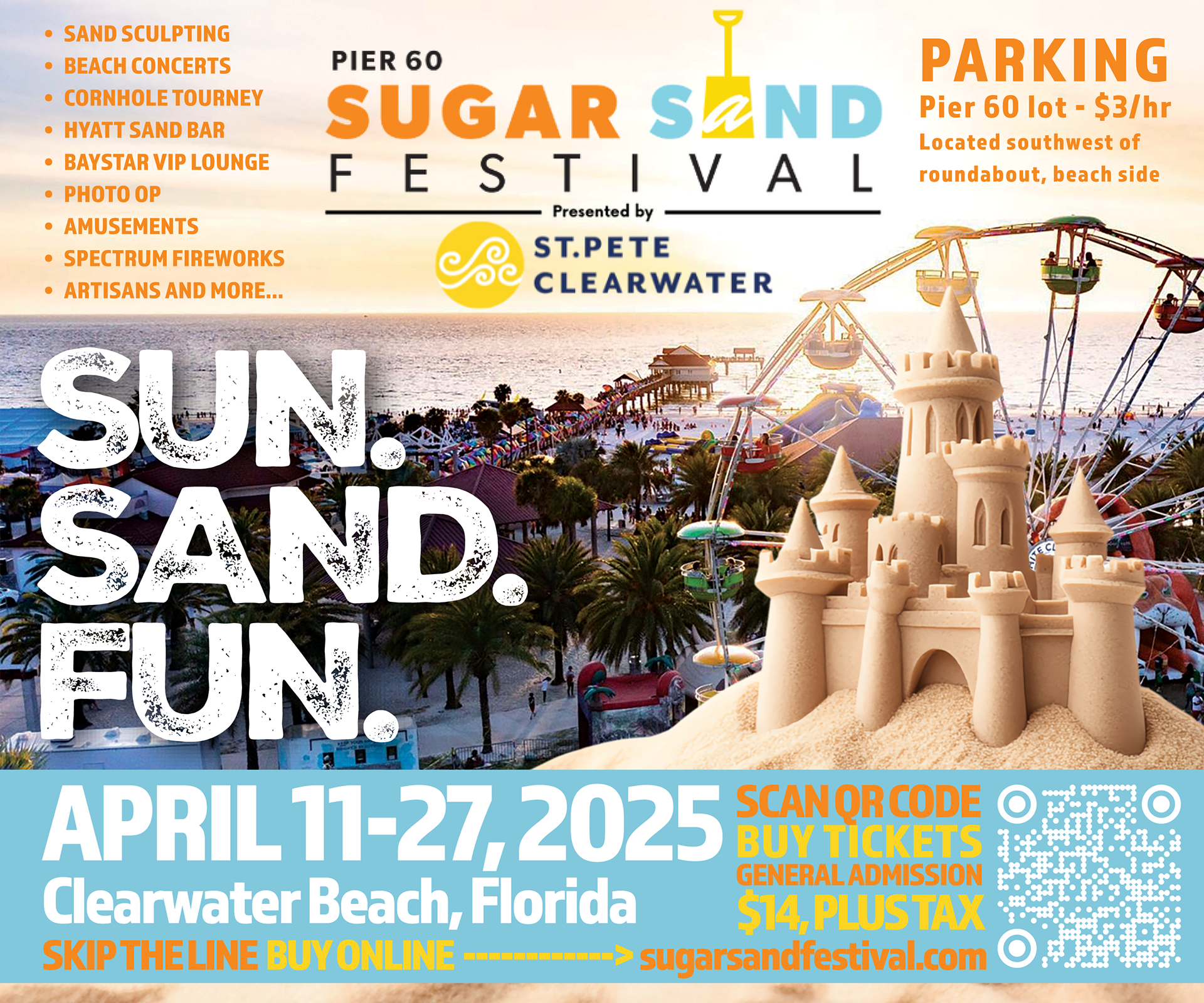
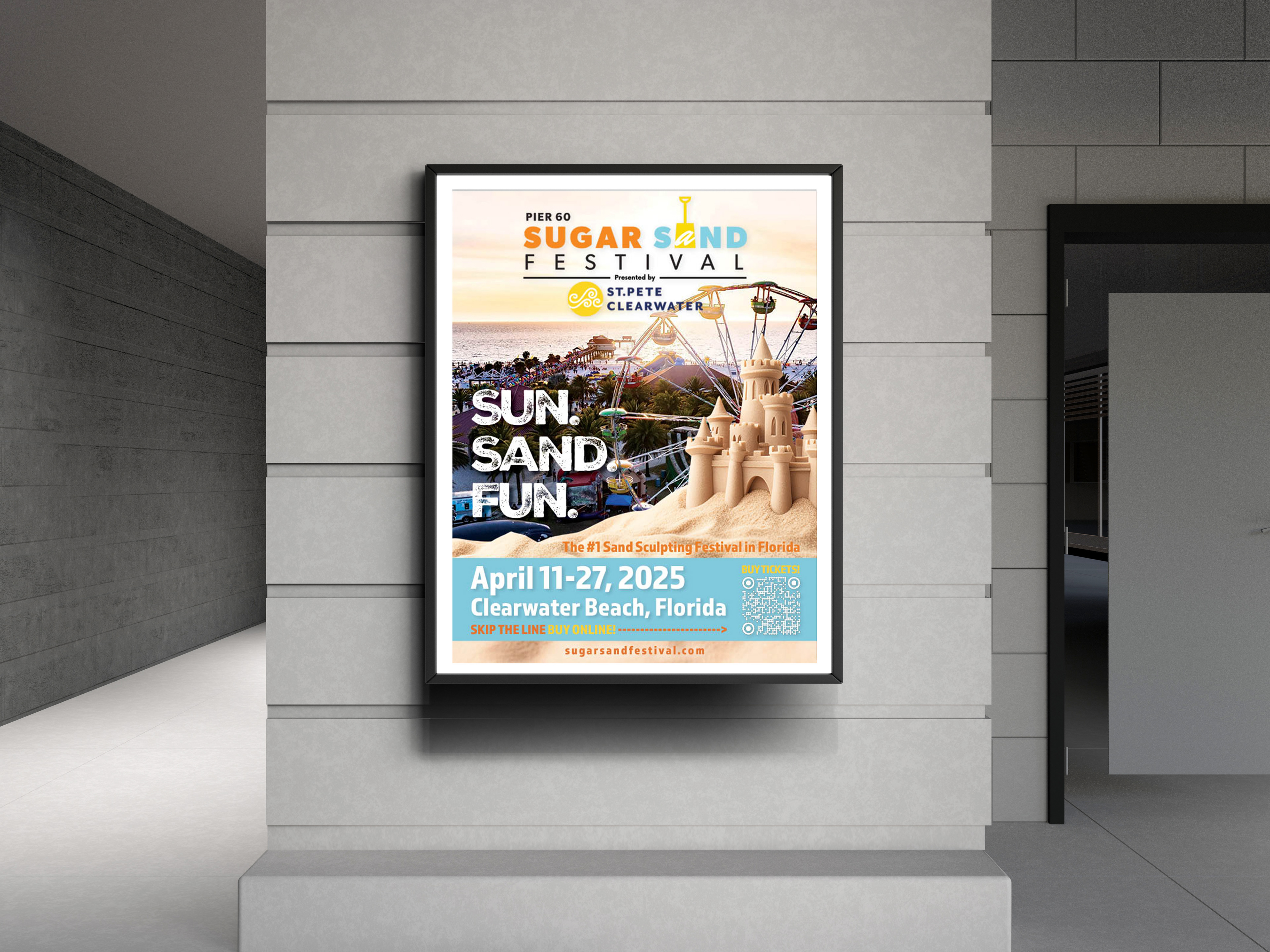
The design centers on a vibrant sunset image of Clearwater Beach, using the Ferris wheel and shoreline as a natural focal point to anchor the composition. A custom sandcastle element adds depth and reinforces the festival theme, while the bold “SUN. SAND. FUN.” headline drives immediate readability and impact across all formats.
Each format is adapted to its environment, from vertical poster layouts to wide-format billboards and responsive digital placements. Information is structured in a clear hierarchy, with a consistent footer system that organizes event details and call-to-action elements such as the QR code. The result is a flexible campaign that maintains visual consistency while scaling effectively across multiple platforms.