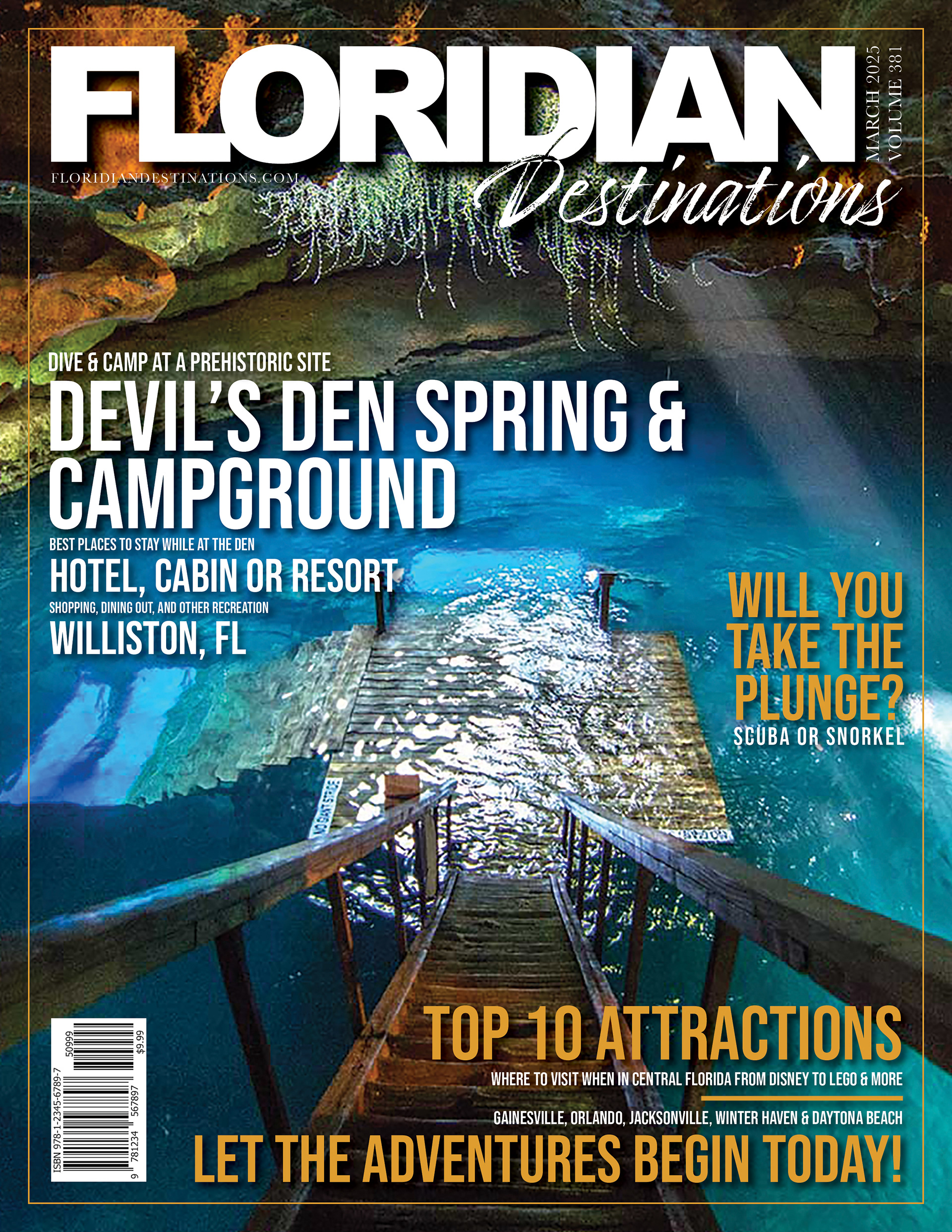
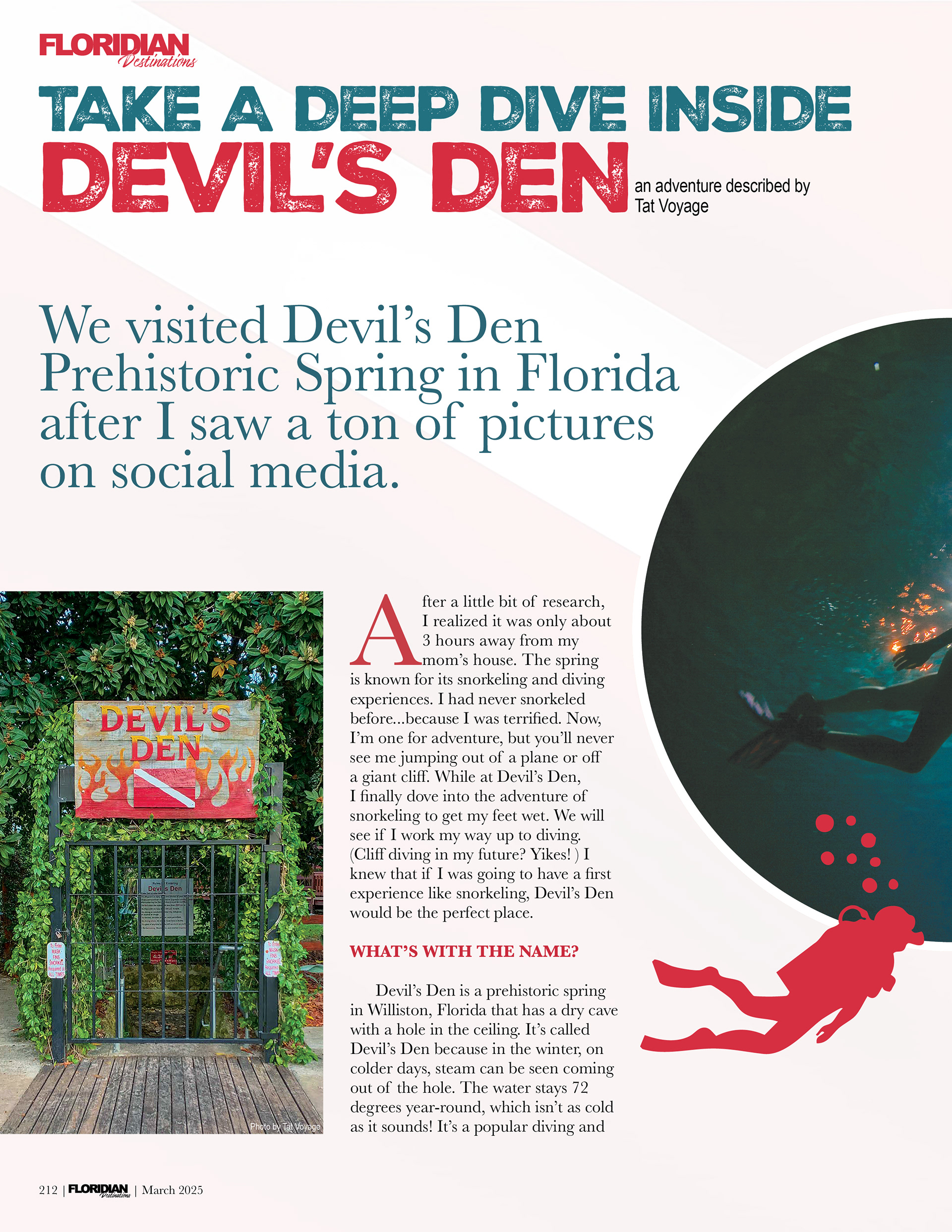
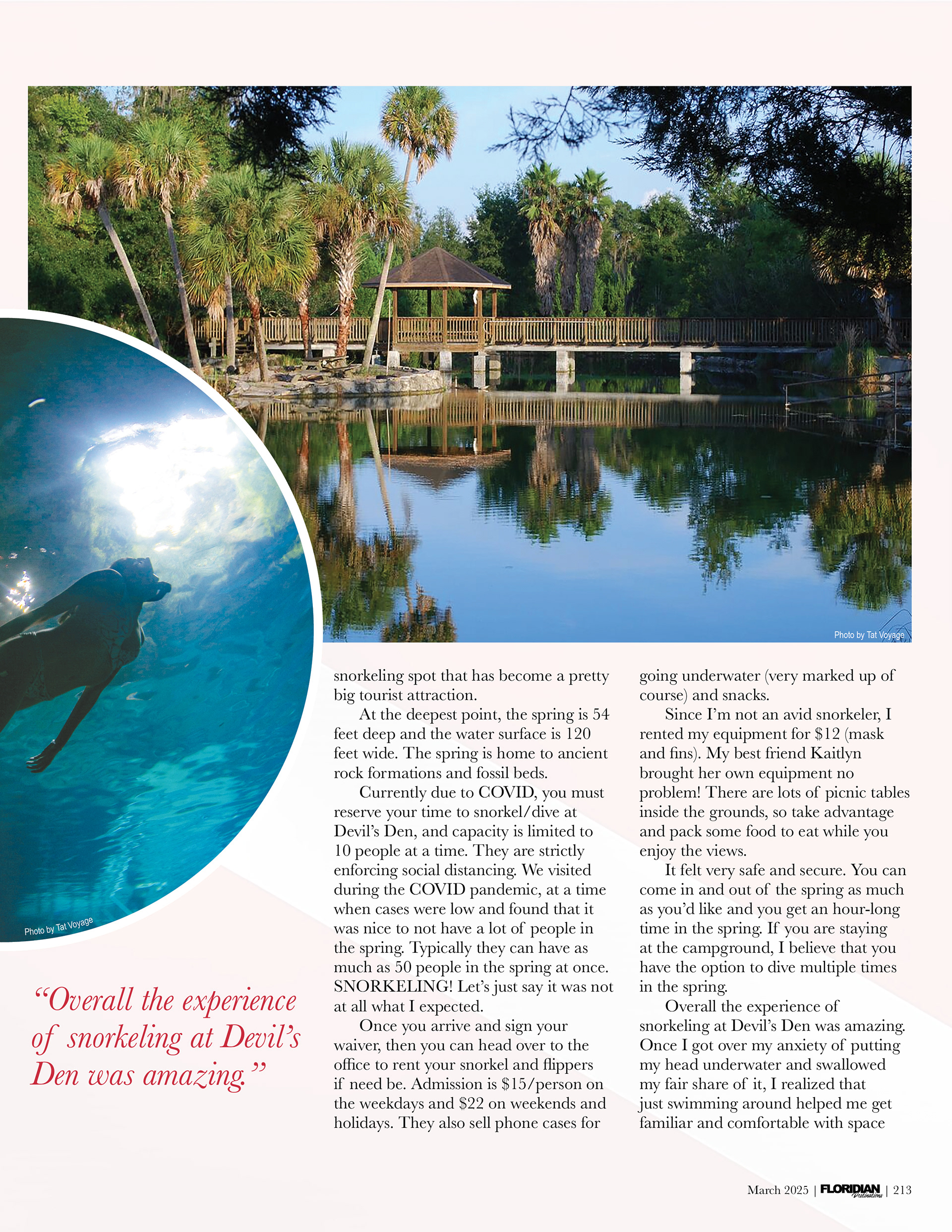
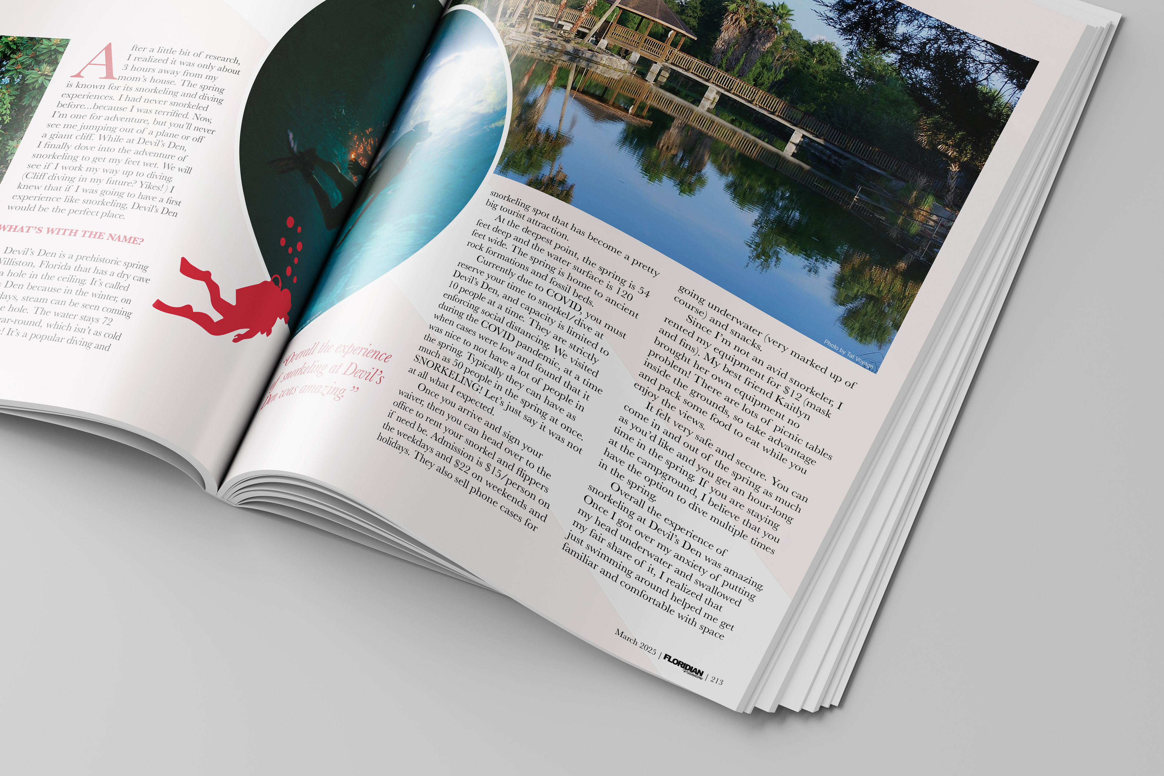
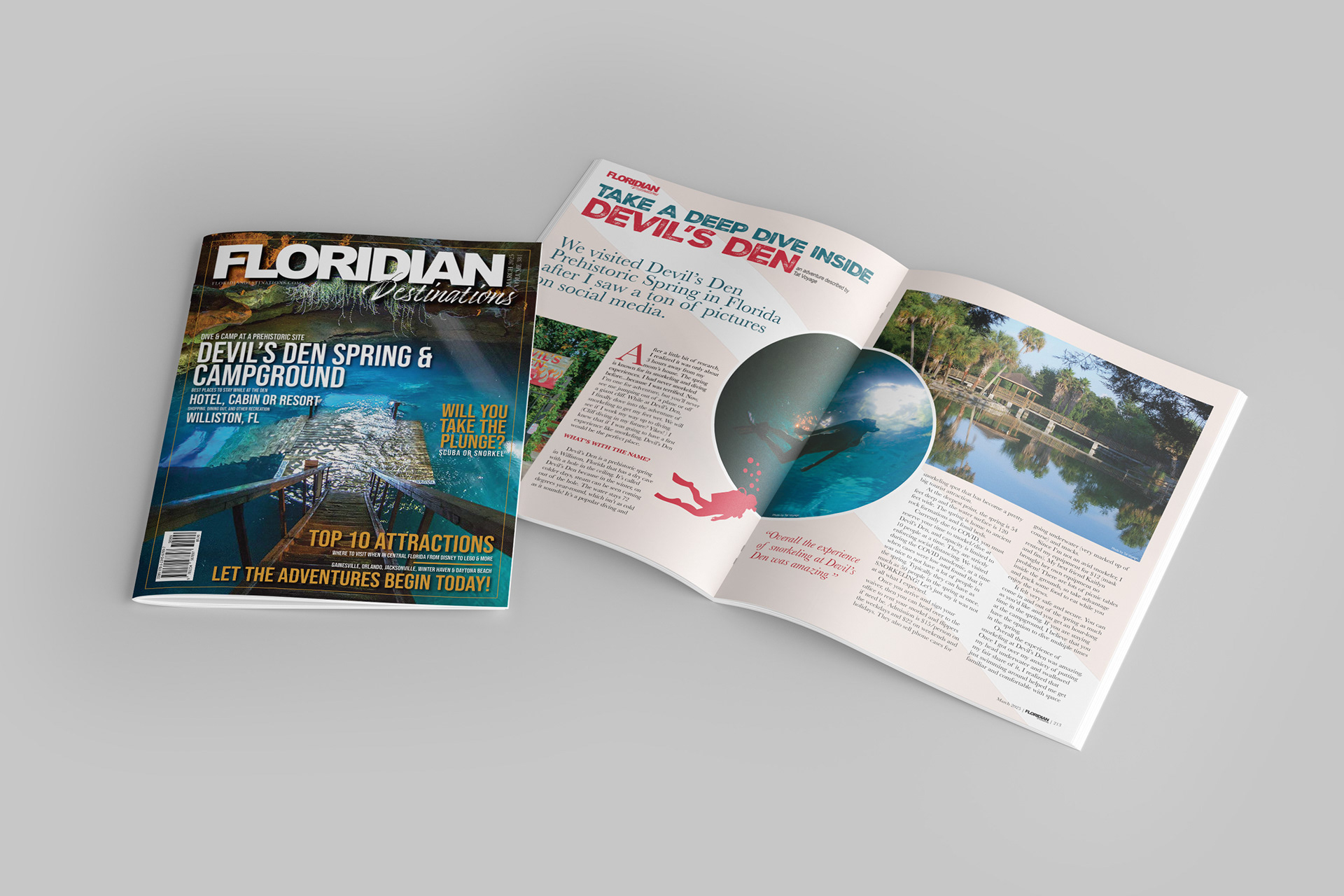
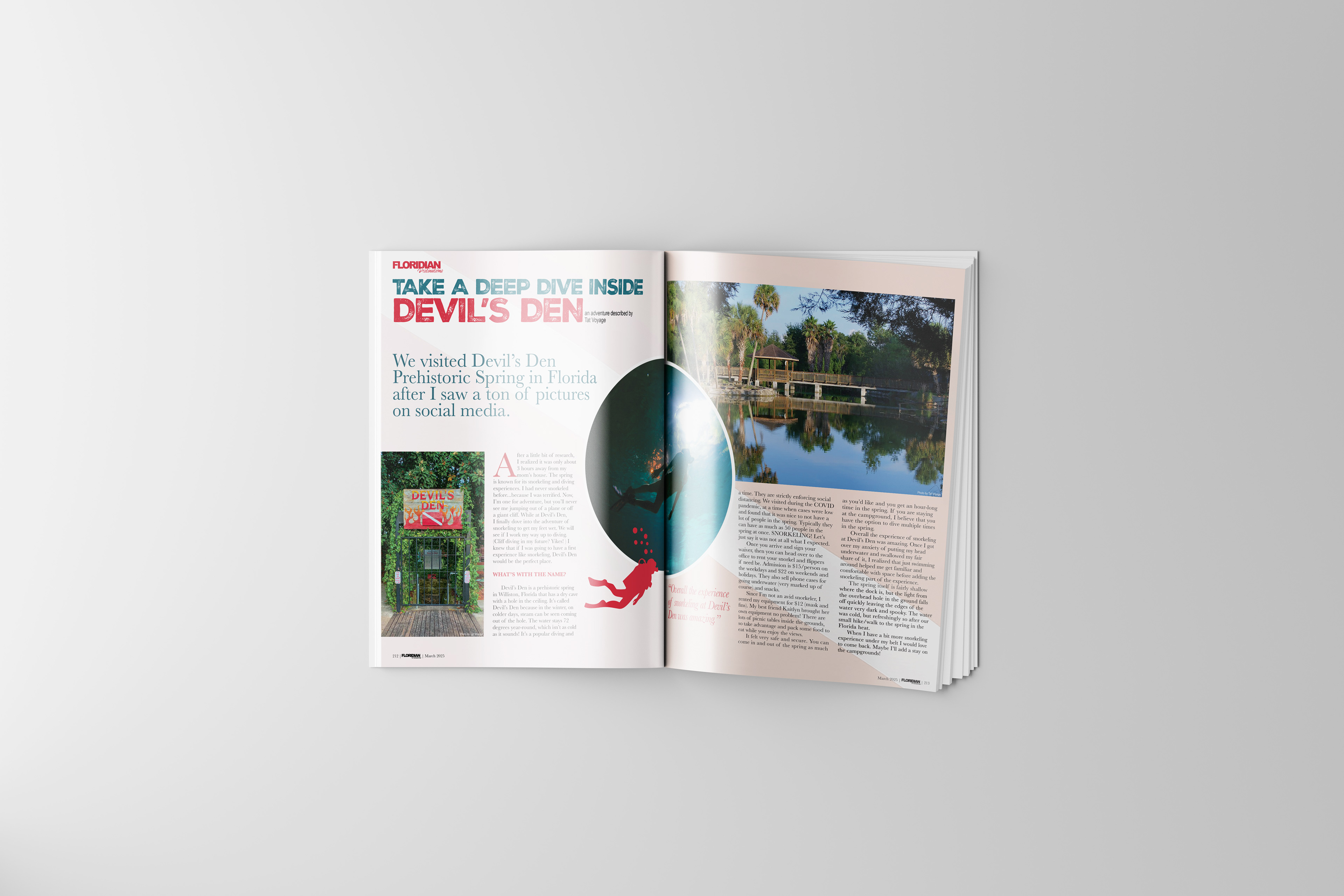
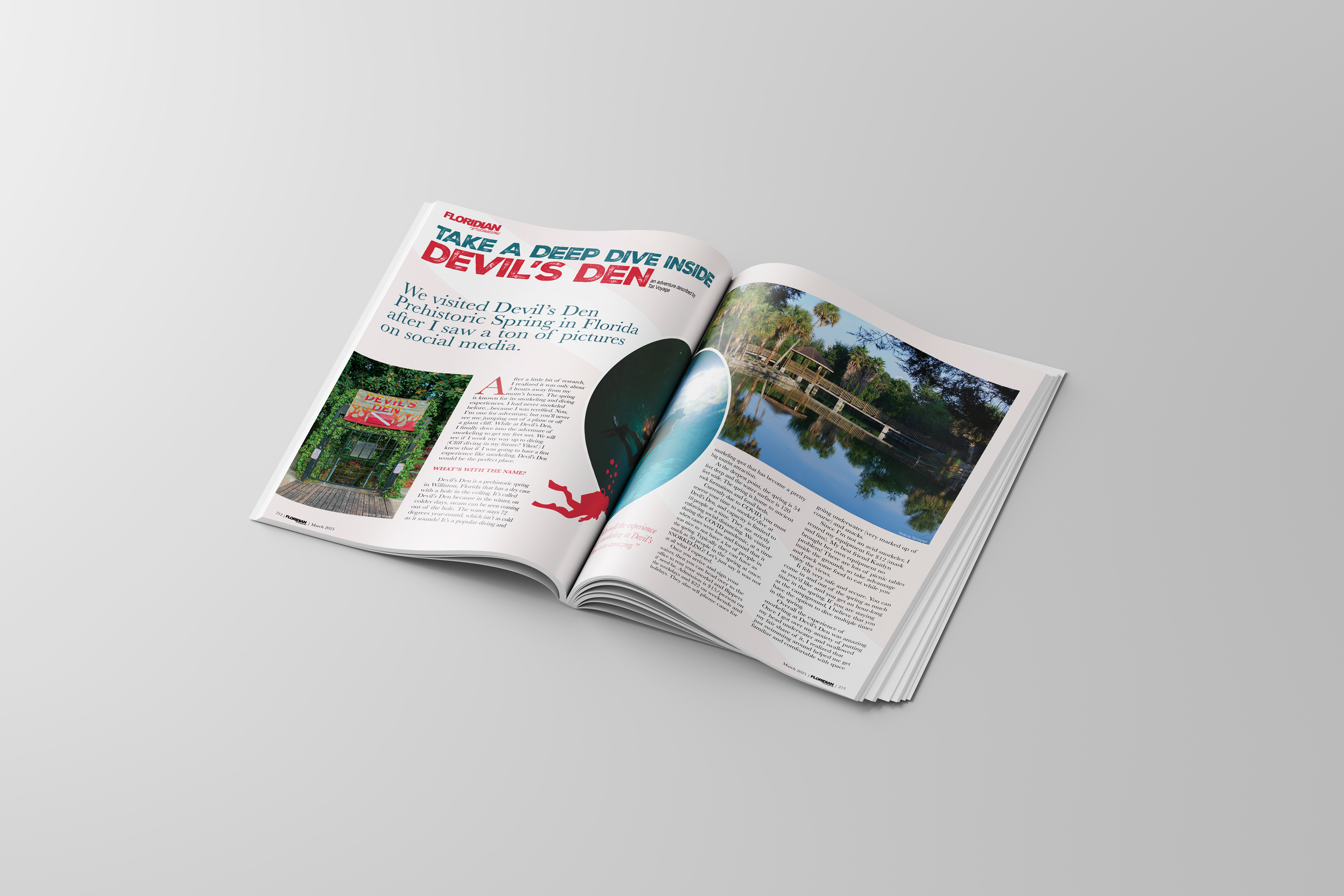
For this project, I created a fictitious magazine titled Floridian Destinations, designing both the logo in Adobe Illustrator and a full cover-to-spread layout in Adobe InDesign. I used Bebas Neue for the bold, modern “FLORIDIAN” masthead and paired it with a brush script that flows naturally into the main title through intentional use of negative space, symbolizing connection and movement—key traits for a travel publication.
For the feature article, I chose Devil’s Den Spring & Campground, highlighting its underwater beauty and adventure. The cover photo showcases the cave’s stunning blues, balanced by warm orange typography to complement the natural lighting in the image. I emphasized font hierarchy to guide the reader’s eye from the title to supporting text, and added realistic details like a barcode for authenticity.
Inside, the two-page spread combines three photographs—the entrance gate, a snorkeling diver, and the surrounding park—arranged within a clean, two-column grid for readability. I layered a subtle diving flag graphic at low opacity for texture and unity. The color palette ties everything together, using reds and aquas from the photos for headers, drop caps, and quotes. The overall design integrates balance, flow, and contrast, creating a professional, cohesive layout that captures the spirit of Florida adventure travel.